Trade Show Booth Design Ideas That Stop Foot Traffic (And Start Conversations)
Nobody walks into a trade show looking for you. Attention is fickle. You know this. You’ve walked a show floor yourself, half-registering booth after booth, your brain quietly filtering out everything that looks like everything else. The banners. The branded tablecloths. The person in the polo reaching forward with a brochure. You weren’t being rude. You were just full.
Most exhibitors try to solve this with more. Bigger banner. Brighter colors. Louder giveaway. It doesn’t work, because the problem was never volume. It was your trade show booth design.
The booths that actually work are built on two levels at once. The stop: a visual that breaks a walking person’s stride in three seconds. And the stay: an experience that gives that attention somewhere worth going. A conversation that’s already half-started by the time your team says hello.
Most booths only solve the first. They get the glance and lose the visit. Great foot traffic. Thin pipeline.
Over the years we’ve built booths that do both, and we’ve learned exactly what separates the ones that perform from the ones that just look good. Here are the exhibit booth design ideas that are working in 2026, drawn from builds we’re proud of.
 Bring Nature Into the Hall
Convention centers are loud, bright, and relentlessly artificial. That’s exactly why a booth with living elements creates such a sharp contrast.
IFCO Systems didn’t show up to the Global Produce and Floral Show with a standard exhibit. They built a Biergarten. Wooden beams, vine-covered structures, warm string lights, brick textures, natural greenery running the full width of the booth. It didn’t feel like a trade show booth rental. It felt like a place people actually wanted to walk into and stay inside — which is exactly what happened.
Your brand doesn’t have to be sustainability-focused or Bavarian for this to work. Any company can make this decision. The effect is psychological: you’re giving people a moment of contrast in a space that offers almost none. And people who feel comfortable have better conversations than people who are overstimulated and trying to escape.
Living plant walls, wooden fixtures, grass carpet, warm lighting — none of this requires a complete overhaul of your budget. It requires a decision to design for how people feel, not just what they see. Read the full IFCO case study
 Build an Interactive Photo Wall
The easiest lead generation tool you’re not using enough: a photo opportunity.
Look at what Brisk Teaching did at ISTE 2025. A neon sign reading “AiD Rather Be Teaching” glowing against a warm wood wall. A ring light on a tripod. Turf underfoot. Staff in cow-print aprons. People queued. They grabbed colleagues. They posted. And every post carried the brand right into the feeds of people who weren’t even at the show.
That’s the thing most exhibitors miss. A photo op doesn’t just engage one visitor. It reaches everyone in their network, without a single dollar of media spend.
The key is that the photo has to look good enough to actually share. A dark corner with a generic printed banner won’t cut it. Think ring light, bold backdrop, something visually interesting enough to compete in a social feed. And make sure your branding is visible but not heavy-handed — it should look like a photo someone wanted to take, not an ad someone was recruited for. Read the full Brisk Teaching case study
Break the Rectangle
Every booth on the floor is a rectangle. Your graphics don’t have to be.
Take this 20×20 build. The booth itself is clean and compact — but a massive spiral ribbon wraps around the entire space, visible from across the hall before you’ve read a single word of copy. Nobody walks past that without looking up.
Curved walls, arched entrances, asymmetrical structures, oversized props — anything that disrupts the visual pattern of the show floor earns a second look. Whimsical shapes work especially well when they connect to your brand story. A tech company using circuit-board patterns on curved walls. A healthcare brand with soft, organic arcs instead of hard corners. A food company whose booth is shaped like their product.
Contrasting elements create intrigue too. Mixing industrial materials with warmth. Rough textures with clean lighting. The visual tension makes people look twice — and a second look is all you need.
Design Your Floor, Not Just Your Walls
Custom flooring is one of the most underused tools in trade show booth design.
This 50×50 exhibit design shows exactly why it matters. Seen from above, the diamond-shaped white floor extends well beyond the booth structure, visually claiming the space before an attendee has stepped inside. Then a curved band of purple and teal sweeps through the interior, color-coding each product zone — Candidate Experience, Recruiter Experience, Employee Experience — without a single wall dividing them. The floor is doing the layout planning, the wayfinding, and the brand storytelling all at once.
For large island booths, this is one of the highest-return design decisions you can make. For smaller booths, a strong floor shape makes the space feel larger than it is and signals that someone thought carefully about every inch.
Simple and bold works better than complex and detailed. At floor level, people glance — they don’t study.
Use Lighting to Do Heavy Lifting
Lighting is the difference between a booth that looks like a setup and one that looks like a destination.
This 50×50 rental booth design is a masterclass in using light to do structural work. The circular halo overhead isn’t just a branding element — it washes the entire booth in a warm orange glow that’s visible from across the hall. On the floor, circular orange patterns spotlight each conversation zone, creating distinct areas without walls or dividers. The enclosed meeting room in the corner is lit separately, signaling privacy and intention. Every zone has its own lighting mood. The result is a booth that feels like multiple rooms inside one open space.
Warm lighting creates intimacy. Cool lighting signals precision and technology. Spotlights on your product make it look like it belongs in a museum. The right lighting can make a mid-size booth feel exclusive and a large island feel electric.
Most exhibitors treat lighting as an afterthought — something to sort out on setup day. The booths that win treat it as a design decision made at the brief stage, not on the show floor.
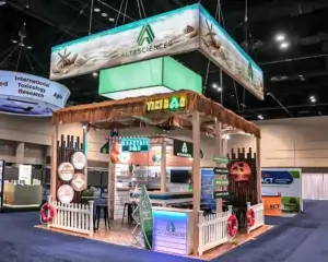
Create a World, Not a Booth
Who decided your booth has to look like a booth? Altasciences built a tiki bar.
Bamboo walls. A proper bar counter with a pergola overhead. Surfboards. Neon signage. The kind of setup that makes a scientist at a toxicology conference stop walking and say — what is happening over there.
That’s the point. The theme isn’t decoration. It’s a strategy. It creates a reason to walk in, a reason to stay, and a reason to come back and bring a colleague. When done well, people don’t just visit — they tell others.
This doesn’t require a massive budget. It requires a clear concept and the commitment to execute it completely. Half-measures don’t work here. The world you create has to feel complete. Read the full Altasciences case study
 Design for How People Feel, Not Just What They See
A purchase is rarely logical. It’s emotional first, then rationalized.
The Alpine Fresh booth at GFPS understood this completely. Every decision was made for how an attendee would feel walking in — not just what they’d see. Rounded teal corners instead of hard edges. White brick texture that reads warm and retail, not corporate. Turf flooring in the lounge zone that makes you feel like you’ve stepped outside. And tucked to the right, a curved “Chill & Chat” corner with green walls and soft seating — a space that quite literally tells you to slow down and stay.
The result was noticed by everyone. It was not just foot traffic. But people who stopped, settled in, and are actually talking. The booth earned the dwell time by designing for comfort first and sales second.
That’s the emotional design principle in practice. When your booth makes someone feel at ease, unhurried, welcome, comfortable, the conversation that follows is warmer and the relationship that starts there goes further. You don’t have to be a produce brand to apply it. Any company can ask: what do we want someone to feel the moment they step inside? And then design backwards from that answer.
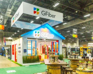
Show the World Your Product Lives In
The best booth for a complex product isn’t the one that explains it best. It’s the one that shows it living in the real world.
Google Fiber’s “Connected Comfort” concept did exactly that. Instead of screens showing speed metrics and technical specs, they built a styled living space inside the booth.It looked lived-in, warm, and completely real. The product wasn’t on display. The product was running the whole thing, invisibly, the way it would in someone’s actual home.
That’s the insight. Attendees don’t connect with features. They connect with situations they recognize. When someone walks into a space that looks like their living room and feels the product working inside it — seamlessly, without friction — the pitch is already half-made before anyone opens their mouth.
This approach works far beyond consumer tech. A manufacturing company can build a scaled version of the workflow their software optimizes. A healthcare brand can recreate the clinical environment their product improves. A logistics company can show the supply chain problem they solve, in miniature, in motion. Whatever your product does in the real world — show it doing that, in a space that feels real.
Conclusion
Three seconds to stop someone. Thirty seconds to earn the visit. Thirty minutes to start a relationship that outlasts the show.
That’s the whole game. Everything in this list — the nature walls, the tiki bars, the flooring that doubles as a wayfinding system, the banner zones that respect where people actually look — is in service of that sequence.
The booths we’re most proud of aren’t the ones that looked the best in a render. They’re the ones where the client came back and said the conversations were different this year. Warmer. More qualified. Easier to close. That’s what good design actually does. It doesn’t just fill a space. It starts a conversation before anyone says a word. If you’re planning your next show, we’d like to help.
Related Posts
New Gaylord Pacific Resort & Convention Center in Chula Vista: What Exhibitors Need to Know