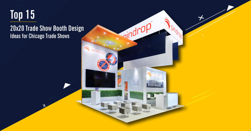
Top 15 20×20 Trade Show Booth Design Ideas for Chicago Trade Shows
20×20 Trade Show Booth Design Ideas for Chicago Trade Shows
Trade shows are great channels to engage with interested sales prospects. They not only help you fuel your entire energy at your trade show display but also provide a new avenue for prospects to get in touch with you.
The immense exposure your brand receives at these shows is phenomenal. Diverse visitors coming to the trade show get to know your brand better.
It is found that 81% of trade show participants have buying authority. So every 4 out of 5 visitors to your booth are potential customers waiting to convert from a cold lead to a hot conversion.
But there is a catch.
There are several other contenders looking for a piece of action at the same venue in your neighboring stall. It means that your booth needs to stand apart from the crowd.
This denotes the immense importance of having a great 20×20 trade show booth. With innovative 20×20 trade show displays, you can engage face-to-face with more number of potential customers and provide a great platform to build your brand with an eye-catching presentation.
Trade show booth design ideas that elevate the level of engagement
If you are attending the next Trade Show Exhibits Chicago and want some inspiration for trade show display ideas then you are at the right place.
Today we look at 15 hot-selling trade show display ideas for Chicago trade shows. Some are innovative, some quirky, but rest assured these ideas are bound to get what you want i.e. attention for your brand:
1- Semi-Private Curtains
Every booth has a designated area for company representatives to sit and chat up with visitors. This is the area that is left in the open, much like the inviting architecture overall of the trade show booth.
But Sunquest wanted to do things a bit differently. It experimented with having 16 foot long string curtains surrounding the meeting areas.
This was in contrast to the typical open areas in a trade show booth. However, it did manage to add a touch of ‘discreet’ to the meeting areas.
Moreover, competitors in adjoining booths have far lesser chances of seeing who is seated in this semi-private area. This, in turn, reduces chances of poaching and risk of losing business.
2 – Virtual Reality
Companies are increasingly using VR experiences to attract footfalls to the booth and boost the level of engagement that the brand receives from interested visitors.
Take the case of Intel. It uses VR at the trade show events to explain visitors about new offerings and innovations happening in the company.
However, the medium it chooses to explain this is unique and distinct. It employs VR technologies to provide a 5 minute immersive experience to the visitors.
Visitors put on VR headset, experience a realistically virtual world, and gain better product knowledge.
3 – Visitor Interaction
Having the visitor involved in an activity, game or puzzle is a sure shot way of retaining their attention for longer. Additionally, it helps to provide the much needed push in engagement when they participate in the activity. The Intelligent Medical Objects’ trade show booth is a perfect example.
Its wall has a chronology of medical coding. Visitors can use post-its to stick notes about their thoughts (be it a missing entry of past or future trends). Also, an artist keeps adding to the wall based on the daily happenings at the event
4 – Dynamic Graphics
Many companies carry around stock graphics, banners, and images which they use for all trade shows around Chicago. However, we see one company that wanted to break this stereotype.
Wholesale medical supplies leaders, McKesson used changing graphics every single day on their wall.
They hired an artist that made new graphics. But not just any graphic. The theme was selected based on customer interaction on social media feeds – thus adding a lot of relevance to the graphics being sketched/ drawn.
They also created a time lapse video of the different design on different days and shared it to social media feeds.
5 – Contrasting shades
All-black is an eye-catching design theme to follow, but very complex to master. Elements seems to have got it right with its almost all-black theme.
Even with a monotone, it had ample and well-marked spaces for product literature, meeting areas, product booth, and workstations. The black shade also made it easy to depict its logo in contrasting white and yellow.
6 – Closed Booth Concept
Usually, trade show booths are kept open to invite visitors in. However, there are a few who are willing to tweak this style and have a closed area concept too.
The booth set up by Swan Cosmetics had walls on opposite sides with an open entrance.
The area still had ample space for product placement, marketing collaterals, workstations, meeting areas, and wall graphics.
7 – Overhead Signage
The large central signage is what calls out to the visitors from far to the booth. When executed well, it has a magnetic appeal that offers a natural pull for visitors. The circular overhead branding and signage put up by Acuative is one such classic example.
8- Multi-tasking Concepts
The same brand also had another great design example – that of using space for multiple purposes. The four ‘sides’ to the circular booth did three distinct things – it provides ample space for hanging banners.
It also accommodates a kiosk to run ads about the product offering. The lower half doubles up as a table space for prospects and brand representatives to meet up and interact.
This can be a great space saving idea of Trade Show Displays Chicago.
9 – Information Packed Sans the Clutter
Forest Harvest had a lot of information packed into the 400 sq. feet. The reception area led to two walls for displaying graphics. Behind it are full length racks to display corporate literature and marketing collaterals. It also serves as a product display wall with ample space.
10 – Faux Environment
 Hyland Software’s OnBase system had an interesting exhibit put up at the trade shows.
It replicated the ambience of a bar complete with brick walls, menu listing with drinks of the day, and an inviting surrounding with bar stools set across a bar table.
The happy hours were great lead generation catalysts.
11 – Island Booth Made Better
Island booths are popular options for trade show displays in Chicago, as they offer maximum traffic exposure from all four sides. Contax has made it even better with its rendition of island booth design complemented by a huge signage at the central overhead space.
It elevates the chances of footfalls with its large signage that makes the brand visible even from far away.
12 – Closed Space in Central Area
The AFEX booth seeks to make a bold statement with its stylish booth. The tower design in the central area is a contrast to popular design styles that recommend an open area in the center.
It also serves to separate the different areas like meeting areas, lounge, kiosks, and workstations.
13 – Improve Visitor Time in Booth
Want to increase the time visitors stay on in the booth? How about printing them a custom design on a t-shirt at the booth itself?
This is exactly what DSS does at the trade show. It has employed machines and operators to dish out custom t-shirts in a range of inks, designs, and colors. They used the printing time to share product information with the attendees.
14 – Cozy Ambience
When EHR hardware provider CliniComp wanted to add a touch of closeness to its visitors, it thought of a slightly different style. It employed draped curtains and chandeliers to create a residential style living room ambience instead of the cold meeting room areas
15 – Tech Device Usage
Siemens had an interesting concept. It placed around 119 iPads on its wall. The devices connected together to send out a unified brand concept message. They synced together and created a great visual effect about its connected care product – CareXcell.
Trade shows are a great way to get sales from cold booth visits. Hence, companies are looking for innovative ideas to amplify the level of engagement and interaction that happens on the floor.
The number of options now available to effectively display branding on a 20×20 space is growing with every passing day. This is aptly demonstrated by the sheer number of choices available for a brand to market its product offerings.
These innovative concepts employed by companies are a real conversation starter. They keep the visitors hooked to the booth and helps them to stay for longer at the booth premises.
These ideas can help you extract maximum efficacy from the next trade show displays in Chicago. Do make sure to utilize these ideas and see visitor footfall and subsequent engagement shoot up.


