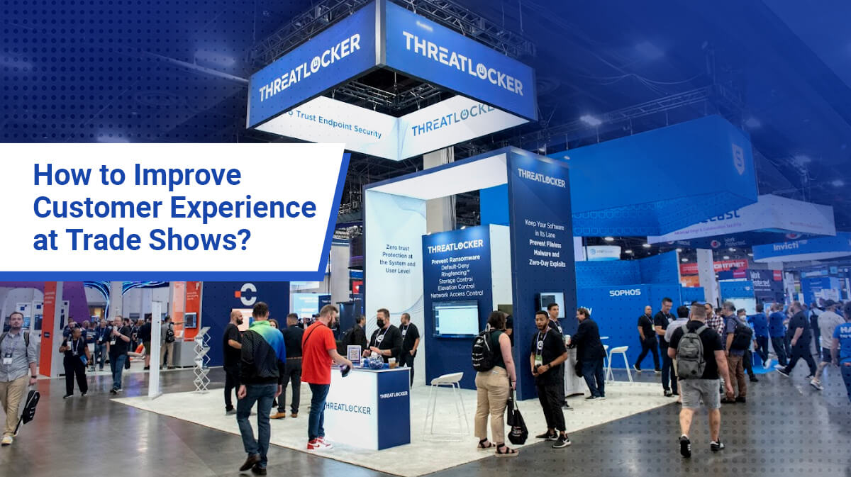
Impressive Trade Show Booth Designs to Attract Visitors
1.1 Importance of Trade Show Booth Design Cannot Be Emphasized More
 With an articulatetrade show booths that catches eyeballs, a thoughtful give-away, a smart contest and a concise sales collateral, you can expect to give a well-rounded experience to your prospective consumers. But it all begins with the booth’s ability to bring the crowd in. And that is where the big D of design matters.
In a competitive trade show environment, all you want to do is gain attention and influence the purchase decision. And to do that, you begin with a strong visual impact. Design of your display booth is directly proportional to your success, and can draw the line between ordinary results and fantabulous impact.
Your design should address the three cornerstones of a good strategy – your brand imagery, current marketing messages, and your big marketing goal. The design must enhance your corporate identity and differentiate your company from competitors.
1.2 Focus on 4 Cornerstones of an Awesome Trade Show Booth Design and Hit the Bull’s Eye
Graphics Go A Long Way In Creating Sub-Conscious Impressions
Larger than life, colorful, yet neat graphics that cover the width and breadth of your booth will be eye-catching. It won’t clutter the little space available and will communicate your story strongly with few key visuals. Don’t cut corners by doing it in-house. A good graphics professionals will go beyond words and tell your message in a concise manner; the importance of high resolution printing cannot be emphasized more.
Left, Right & Centre Let Your Logo Rule
Don’t shy away from going overboard with your logo display. It can be front, back and and center. But don’t go below eye-level. Place it at so many locations that missing it is nearly impossible. Remember, more than 3/4th of visitors won’t even step into your booth. At least they can take home your logo and tagline. Also know and accept that if you are not Apple or Microsoft, your logo needs to be backed by a line that describes what you do. It need not be a creative slogan. It may just be a well-crafted statement that covers your differentiation.
Light, Camera, Action
We have seen a good design die down on the show floor with lack of lighting. What looks good on computer screen will come to life only with right ambience. Use proper lighting at the right places – above your product display, behind your key banner and near your discussion area. Good lighting and right music can lift your attendee’s mood too. Some shopper behavior science put to good use will go a long way in making your booth a success.
Hail Technology
 Trade shows are traditional ways of marketing but don’t limit yourself to conventional means of marketing. Your staff won’t be able to attend to every inquisitee mind around your booth. Feed the on-lookers with videos and interactive displays that explain your products in an interesting way. Technology can be a conversation starter. Encourage your attendees to click, share and go social right from your booth. Make your booth a Wi-fi zone. Incentivize the tech-forward attendee around you.
According to trade show expert and author Steve Miller, there are five key elements that make exhibit displays and banner stands visually gripping to make an impact on the exhibition floor. These elements are color, lighting, motion, sound and smell.
1.3 Embrace Newer Trade Show Booth Design Forms for Better ROI
It is important for exhibitors to acknowledge their choices before betting on any one booth form. Making an informed decision will save you big time on effort, time and money.
Modular Displays: Modular displays consist of standard blocks that can be reconfigured into different sizes to fit multiple show needs. It is a dynamic concept that evolves and adapts itself to changing exhibitor needs. Whether you want a small in-line booth or a large island display modular can be re-sized to make your show ready in no time.
There are two types of modular exhibits:
- Off-the-Shelf Modular and Customized Modular.
Flexibility: One investment will stay with your for many shows and you won’t have to redesign for new shows from scratch up. Just a few modules added or removed can be job done.
Low everyday cost: You may think about cutting down on the design cost but won’t realise the big expense you end up making in transport, installation, assembly, and storage of booths in the entire lifespan of a booth. A modular booth can help you save on all fronts and can make a huge difference to your ROI in the long run.
Custom Exhibition Stands: Custom stands depend on a lot of joinery work. They need big team for assembling and dismantling. They can rarely be reconfigured for a different purpose. Seasoned exhibitor love the impact it gives and go outright with it. Infrequent exhibitors try to find a middle ground with rental custom stands.
One big advantage that cannot be overlooked:
Brand Oneness: Wherever your prospective consumer sees your brand they see just one face. All your identities are linked to same branding guidelines, giving you a consistent look wherever you go.
Hybrid Booths: They are a cross between different booth types. It can be a mix of modular, custom and portable capabilities. So what you get in best of every world. There is brand consistency yet there is no compromise on operational costs. And there is flexibility of moving the modules to fit different shows. Hire a good consultant to tell you which parts need to be fixed and which ones must go modular.
1.4 Increase the Impact of your Trade Show Booth Design
Research says : The physical size of each international trade show has grown from initial 2,000 square meters of floor space to almost 24,000 square meters in most of the shows.
 Trade show booth design has the difficult job of telling a lot in a compact space. Graphics designers go crazy thinking of new ways; only a good exhibit house can invent and innovate every single time.
There is so much distraction on the tradeshow floor and every exhibitor comes with their marketing hat on. Everyone is at his best and the art of wooing gets tougher. Even an extra-ordinary booth design can flatter. Here is what you need to do.
Design To Include Engaging Bits
Don’t just erect a beautiful design and leave it on its own. Make it interactive and engaging. Bring touch and feel elements so the attendees stop by to do something interesting while your sales staff steps in for more interaction. The more the attendee stays on your booth, the lesser he will stay in your competition’s.
Keep Important Elements Above The Line of Sight
 What you see at the design stage is an empty booth. What happens in real life is the exact opposite. The booth will draw hoards of crowd who will stop by to talk to your staff and will stay there for a while. All the passer bys will only see people and their backs. Anything kept below eye will be lost. There is a reason why average height of booths has gone way higher than what was in the past. In fact you see large arcs displaying brand logos so nothing is left to chance. Use the height limits to your advantage. Let your logo peek from everywhere.
Less is More
Every graphic designer is at his very best, always. The visual clutter floods an average mind so much that visitors barely recall 10 brands at the end of the big show. To make through the 10, you need to stay away from the urge to say a lot. Don’t put the burden of speaking everything on your booth banners. You will have staff to elaborate later. Strip all unnecessary overload. Even if you consumer takes home one strong message, feel content. Trying to give him 4 messages will bring you zilch in results. All say everything you want to in a human language that is simple to understand. Strip the marketing jargons.
1.5 In a Nutshell
 Structural Design is As Important As the Graphic Design – Know where the eye level is where the panels should be. It may sound silly but lot of exhibitors don’t pay attention to detail. The letters and messages are cut through between panels. The structure will have a lot of joints and breaks. If your graphics lay right there in the tight spot where the joints happen, they will look too ugly. All your great designing will go down the drain, Do a dry run before the actual show if your imagination is not very good. Match the structural beams with the graphics.
Design For The Target Audience, Not You – What you like is not what your audience will necessarily like.
- The font you choose – simple or fancy must also be governed by the demographics of your audience.
- Stay professional at all times. When it doubt, select simple over jazzy. Reading gets simple.
- Don’t use the same font size everywhere. Close ups can go smaller on font and distant messages can be bigger.
Quality, Quality, Quality – Don’t cut corners at the wrong ends. If professional designing and printing is needed, in-house will not do. Absolutely no. ·
- Pay attention to resolution. Right DPI based on sizes.
- No freebies from internet for your graphics, please. Buy only high-resolution printable pictures
Extract from Article by Matthew Govette, Trade show and management expert-
If you lack the time or the trade show know-how to create a top-notch custom trade show exhibit, get a pro to build it for you. Even if you think you can do a great exhibit on your own, a trade show booth design expert can help you integrate the latest technologies and be a second qualified eye. Most importantly, many companies will even set up and take down your exhibit for you. An investment in a trade show booth that will make your brand pop will be worth it at the end of the day.
These extracts of the experts are extracted from Web search .
Summing Up
If you are about to participate in an International Trade fair and have queries, please visits us on any of the social support detail mentioned below. The most important purpose of the booth design is to attract attention – of course in a very positive way. Breathing room is vital to keep designs from overwhelming the viewer.
Thanks for reading the article and happy exhibiting!
