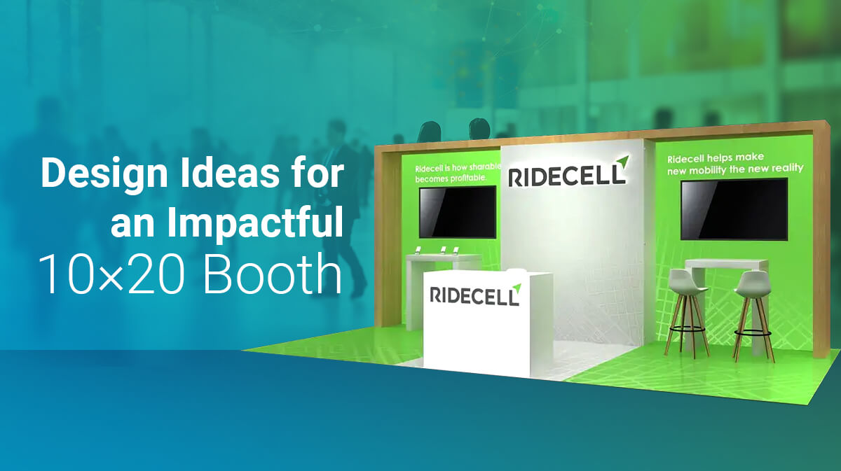
Creative Ideas for Your 10×20 Trade Show Booth Design
A 10×20 trade show booth rental offers budget-conscious exhibitors more room to get creative. The size makes it easier for visitors to navigate in your booth at their own pace.
This also makes it easier for you as an exhibitor, to comfortably engage with multiple visitors without bumping shoulders. Unlike, a 10×10 booth, where it becomes difficult to interact with visitors without feeling confined.
A 10×20 booth also has more space for product placement. It’s width lets you experiment with the height and the shape of your walls. You can give your back wall curved or sloping edges, distinguish your reception zone, from your meeting zone and product display, by giving each of them a different ceiling height or wall exterior.
Now that we understand what 10×20 booth designs offer, here are our ideas to help you make the most out of it.
Add Empty Spaces
You booth needs to be easily accessible to look inviting. Empty spaces in your booth let visitors enter and exit without bumping into anyone. Empty spaces also function as borders to separate different zones in your booth. They are crucial if you plan to have meetings with prospects, being able to keep their personal space, makes visitors feel comfortable.
Brainstorm Theme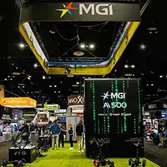
Rental exhibits that are larger than 10×10 give you room to explore different designs. You have the freedom to find designs that tie into your brand message. So don’t limit yourself to the designs provided by your booth designer.
Work with them to figure out, how you can make your booth stand out from your competition. An F&B company can have a display counter with samples, while a toy company can have a larger-than life model of its flagship product on display.
Use Overhead Hangings
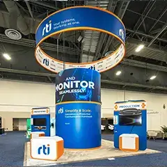
Overhead hangings are attractive and beautify your booth ceiling. Hangings also make your booth more noticeable. When human vision calculates the distance on the fly, it’ll compare the hanging object with the back wall, which makes your booth look larger.
Finally, overhead hangings are quite versatile, you can use hanging lights, paper decorations, banners, and more. A word of advice though, when it comes to overhead hangings less is more. Think of your overhead hangings as a complimentary add-on to your booth graphics, product display, meeting zone or reception area. Don’t make it the center of attraction.
Use Strong Graphics
Use strong graphics for your back wall, this makes your booth design pop out. Since, a 10×20 booth is wider in size, you can convey more visual information at glance.
Humans have a normal visual field of 90 degrees, so by having vibrant graphics across your booth’s back wall, you will get your brand message to the viewer in seconds.
Repeat Your Product Wall
Repeat exposure is how you strengthen brand recall. Along with graphics, have a repeating product wall, will nudge your visitors to browse and interact with your products. Even if they don’t buy it now, they will remember your products, when they need it.
So what if you offer services or provide digital products? Then have a digital product walls, with the help of LED screens or touch screens to display your digital products along multiple walls.
 Plan your Lighting
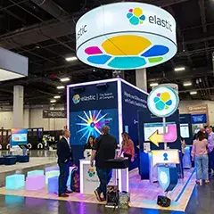
Lighting is a strong ambassador for any booth design. Strong lighting accentuates the theme of your brand, weak lighting dulls it. Lighting when done with proper placement and intensity distinguishes even a 10×10 booth from its adjacent competitors.
As an exhibitor you have several choices for lighting, backlighting to make your graphics and product shelves pop out, spotlighting to focus attention on your demonstrations, and colored arm lights that let you create a specific ambiance for your booth.
Should you add technology?
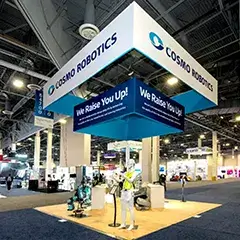
Use technology, only if it’s relevant. Just because you have the budget to integrate audio and visual elements, doesn’t mean you must. As much as technology is an integral part of modern booth designs, it’s important that you plan these elements carefully. Don’t add a large video screen, if it’s going to get blocked by the booth across the corridor.
Even elements such as AR and gamification needs to be designed with care, adding solitaire to your touch screen is not going to make your brand memorable, likewise using an AR photo booth is irrelevant, if you can’t create a proper mental association in the minds of your prospects.
For example, some universities at education fairs use AR photo booths (that let you insert yourself in a different background) to let potential students take scenic photos of their campuses or famous locations in their cities.
Give your booth a worthy crown
Use decorative crown moldings to add depth to your booth walls. Crown moldings as the name implies are decorative protrusions at the top of your booth wall. You can give your booth design a visual edge by inserting backlighting into the moldings or adding a complementary coat of paint.
In some designs you don’t even need a wall to support the molding, it works just as a decoration or as a 3d version of your brand logo as seen in this design.
So there you have it, design ideas to augment your 10×20 booth designs, we hope that these ideas have given you a new perspective on how make the most out of your 10×20 booth space.
