7 Visual Design Tips to Win More Visitors and Boost ROI
In today’s highly competitive business climate, startups seem to be setting aside more than a third of their marketing budget to participate in trade shows.
While this may seem like a lot of money, it’s actually not very surprising. Attendees at trade shows are serious customers who do a lot of homework beforehand and come prepared to take decisions. Once your brand creates a buzz at a popular event, success is all but guaranteed.
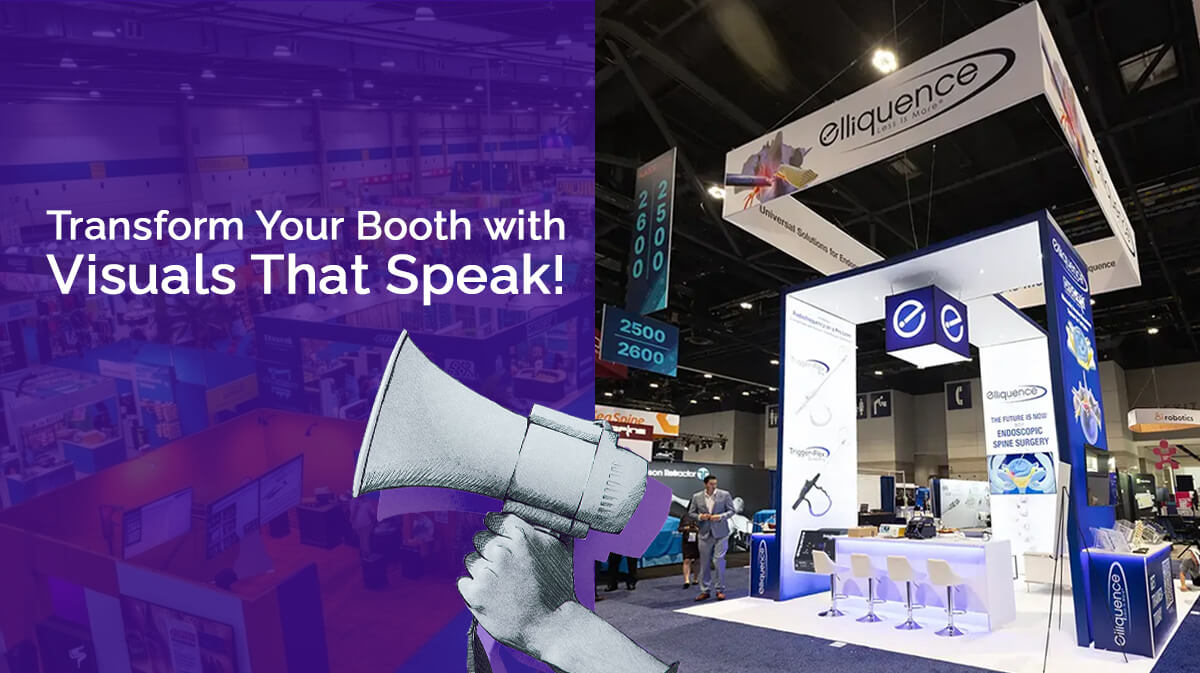
So, if you want your trade show booth design to stand out, your design process must be focused on capturing the customer’s attention visually.
First impressions are usually the last at crowded events and it is crucial that attendees find themselves being drawn to your booth. We are happy you found your way here, because we have some great tips for you in this regard!
Maximize Your Trade Show Returns Through Visual Impact
It doesn’t matter whether this is your first time at a trade show or if you have done it all before. Your first step remains the same – state your goals.
What do you hope to achieve at the event? Is it to unveil a new product? To gather new leads? To generate a curiosity factor around your brand?
Whatever it may be, every decision around your booth should be driven by your stated goals so that you never lose sight of what it is that you hope to gain from this investment.
The next important step is to freeze your budget. Regardless of whether you plan to build your own trade show booth design or bring in a trade show exhibit partner, it is crucial for you to understand how much you can invest in the event without throwing off other mandatory expenditure required to keep your business running.
Remember, balance is key here. Spend too much and your margins will go for a toss. Spend too little and you’ll end up with a trade show exhibits that is uninspiring and dull and will fail on almost every count.
Let us now look at some all-important visual factors that will ensure that your attendees will remember your brand long after the event’s done and dusted!
 1. Color
The first visual element to knowingly or unknowingly grab our attention is color. It is important to bring focus to your brand colors through your trade show displays.
Everything from the uniforms that your staff wear, to the displays in the booth, the brochures or merchandise that you plan to distribute, and the signage around your booth should all celebrate these very same colors.
In addition, focus on complementary colors that can enhance visual appeal. Don’t go overboard with bright shades unless it is warranted by your theme.
So, while blues will add a traditional veneer to your expo displays, reds will add an element of excitement, and blacks will add a stamp of authority and power. A clean trade show booth design with at the most 2 or 3 colors packs a wallop.
 2. Lighting
This is the next important aspect that can spell the difference between success and failure. The most eye-catching booths are bright and welcoming while being neither too harsh nor extra subtle.
Your trade show display ideas should use excellent quality spot lighting that brings just the right amount of focus on what you are trying to sell.
Use lights on the back wall of your booth to give it an illuminating aura. Front-lit lights work best on your banners and signage around the booth to make it visible from both sides, even from afar. It is important to ensure that your lighting complements the lighting on the event floor.
Lighting is especially important if you are stuck with a stale location at the event. Regardless of how good your booth is, customers may simply not find their way to it often.
In such cases, LED light strips and light bars placed around your signage will play a pivotal role in calling out to your audience. The use of halogen lights is not recommended anymore since they produce a lot of heat.
3. Quality of materials
We cannot stress on this enough – DO NOT scrimp on the quality of materials used in your trade show displays. Nothing is a worse advertisement for your brand than sagging displays, poor print quality, or banners that are coming off at their edges.
An impression once lost is very hard to regain. Any extra cost you incur to build high-quality and durable banners, brochures, displays, and other marketing materials is absolutely essential.
Similarly, invest in excellent quality printing services that will add a professional feel to the finished product. An added advantage here is that these same displays can be reused in the future at other events, too!
 4. Optimize the space available
When you start thinking about the trade show booth design and layout of your booth, don’t forget to consider the space you have booked for the event.
Corner booths are to be designed very differently as compared to mid-aisle booths. If you want a significant footfall at your booth, ensure that you are making optimum use of the space available to you within and around the booth.
For example, corner booths are highly coveted not only because they are easily accessible, but also give attendees the option of viewing your displays both from the front and the open side.
So, you have to ensure that your displays are retrofitted accordingly. If you are going it alone, start by studying popular trade show booth design trends in the industry today.
If you are partnering with an exhibit rental company, they can provide invaluable advice in this regard.
5. Taglines do the trick!
No more than 6 words. That’s all you need to grab your customer’s attention. Come up with an attractive tagline that tells people what your brand is all about.
If you are very new to your business, your tagline should actually take precedence over your brand name, because that is what will get people interested in your trade show booth displays.
Remember to have your tagline set up at the focal point of your trade show exhibit. This would be the area that would draw a person’s attention the minute they lay eyes on your setup.
Attendees should view your trade show booth as a well-planned and organized unit built around that very focal point. This ensures that when they walk away, they take the image of your booth with them, thus drastically improving brand recall.
6. TMI is particularly unwelcome
There is something as too much information in the tradeshow world too. Putting everything out before the customer all at once can be a major turn-off! Plan and prioritize the hierarchy of your information.
For example, the signage, tagline, and major displays around your trade show booth must only do enough to get people inside. Having large trade show displays for everything under the sun will ruin the seriousness of your presentations.
Similarly, displaying every small piece of content related to your product will overwhelm customers to such an extent that they may simply walk away.
7. Variation in content dissemination
An attendee who walks by your trade show booth will first get drawn to your signage, taglines, and other static content that you have prominently placed around your space.
But once they step in, they should be drawn to your message immediately. Technology comes in very handy here. Have display screens or touch screens that talk about your product or brand in clear and lucid language.
A very important tip that you should keep in mind is to never depend solely on audio for your presentations since noise on the event floor can easily drown that out.
If you are launching a new product, have trade show display or workstations where your customers can have a quick first-hand demonstration.
When they are ready to leave, ensure that you hand them printed brochures, merchandise, or materials that further your brand’s message and drive home your product’s vision.
Never compromise on quality on even the most insignificant of handouts. Let your customers understand that when they work with you, quality will never be taken for granted!
Before you move on…
We may have covered all the big-ticket items, but a big part of your booth’s visual appeal will come from focusing on the tiniest of details.
Make sure that your tablecloths are ironed and do not get crumpled as the day progresses. Your staff must have a smile on their face at all times and have an enthusiastic and welcoming approach.
Don’t use any jazzy patterns on trade show booth walls since they can easily distract from the message your displays are trying to convey.
Let your brand’s logo be seen both on your uniforms and on your merchandise. Have a host stand at the entrance to your booth, engaging visitors as they pass by.
Spend some time before the event speaking to teams who have attended trade shows in the past and get some insight from them if possible.
