25 CREATIVE TRADE SHOW EXHIBIT DESIGNS TO OUTREACH YOUR BRAND VALUE!
Customizing your trade show exhibit design to align with your marketing goals is a current hot topic in the business world. When you choose to get your trade designs according to the exigencies of your brand, it looks more like the language of the brand that is being spoken in the trade show.
Brands that choose to get customized designs aims towards making their appearance recognizable into the minds of the potential leads and end up creating an inevitable place for their brand in the big business world.
Embrace the necessities and specifications of your brand while keeping the budget right in your hand. Not everyone who comes to showcase their brand in a trade show has the same budget allocation.
Once you choose to put up customized designs for your brand, the budgetary concerns are minimized where you get full flexibility in meeting these constraints.
A well-deployed exhibit designs at a trade show attract visitors to a greater degree while giving them the full understanding of your brand through your customized effort in speaking the language of your brand.
Have a look at these exclusive designs crafted by Exponents with a value proportion in each of the designs
 EMBRACE IMMERSIVE TECHNOLOGY FOR GREATER REACH
Whether you own a small business or a large enterprise, incorporating immersive technology can work in favor of your brand. As in this design, the ultimate focus is on the LED screen which is used for constant branding.
Getting such customized features. your brand can reflect a detailed look that attracts maximum visitors. Along with character showcasing it will also bolster brand image that can act as a focal point to the potential customers.
REDEFINED DESIGNS FOR AN ESTABLISHED BRAND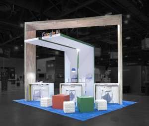
The brand with great market value and already following customers, investing a humongous amount in a trade show makes no sense. As in this image, the brand surely looks popular with lavishing yet simple design to keep it basic.
The purpose of participation, of the established brand, should focus on engaging with the customers amongst whom they have a positive outreach. Instead of unnecessary spending, invest some amount in offering giveaways.
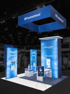 BRAND COLOR CODING FOR EASY RECOGNITION
Every brand has its own essence and vibe that speaks for the brand. It’s the essence combined with the appearance that makes us recognize the brand throughout.
Same is the case of the above design. The above design is effortlessly portraying the color combination of the brand. When the visitor glance through this exclusive design, he is sure to absorb its essence and that can have a long-lasting impact on him.
BUILDING STRATEGIC DIALOGUE FOR ENHANCED BUSINESS RELATIONS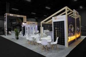
Communication is the base of achieving the milestone. In case of business, the key point is a focus from where the alliances are developed.
Brands that participate in various business events has a pre-built idea to navigate potential clients into forming alliances. For such purpose, the given trade show exhibit design work wonders.
The complete balance of the open and breathing spaces with the strategically placed sitting areas at a measured distance creates an overall environment of conversation, communication, and long talks.
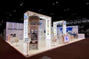 MULTI-TASKING DESIGN FOR MULTIPLE BENEFITS
Such a design says a lot about your company. Your strategies of brand positioning and object placing can ideally have a lot of meaning that a visitor might seek. Talking about multitasking place, the visitor visualizes the credibility of your brand based on your chosen design.
In this design, the distinct corners are built with a definite purpose where the entry is backed by a machine-like structure followed by brands value proposition and the site up. The overall look aggrandizes the brand’s appeal and enables to attract the attention visitors.
MAKE THE MOST OUT OF YOUR SPACE
Opting a small spaced corner is not a disadvantage if you use each bit of it in balanced branding. In the above design, this concept looks quite clear!
The area utilized in the above design cannot be categorized into luxurious space, but the balance it has created with a consistent branding in the space makes the full use of it.
No matter how small the chosen area is, try to invest maximum brand building by using each bit of it.
 FLOOR PLANNING FOR ORGANIZED DISPLAY OF YOUR BRAND
Looking at the design carefully, the above shown design is created for productive use, as it has distinct compartments for different uses.
The front end has a sitting area for sprint meetings, the branding is right at the center followed by the special corner for product display.
The complete set up of this designed looks perfectly planned to achieve its goal. Floor planning plays an important role in communicating your message to the target audience.
BIGGER SPACE FOR GREATER BENEFITS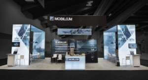
Open space plays an effective role in bringing potential clients towards your brand. The focus point of open spaces is, it needs to have uncluttered spaces and breathing areas as shown in this design.
As this specific brand has used relatively larger space, it has enough space to accommodate a relatively large number of visitors, the chance of lead conversion in such setup is maximized.
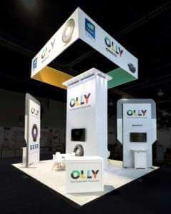 AUGMENTING BRAND MEMORY FOR EASY RECOGNITION
The need for brand consistency is the ultimate key successfully highlight your brand amongst the potential visitors. But how do we achieve brand consistency in a specified amount of space and time?
High signage boards, mid and low-end pillar and uniform color can thematically build a repetitive signal and easy recognition into the minds of the visitors.
In this image, it’s quite obvious what the brand is trying to display- Keeping the brand image at the forefront for augmenting brand memory into the visitors.
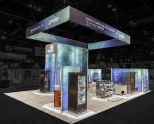
THE ALL NEW VISUAL SENSOR EXPERIENCE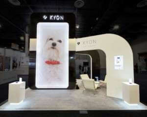
In the digital era of the world, what else can work better? The sensor-driven experience is an incomparable strategy in building a successful hands-on experience for all the visitors.
The use of mobile like structure in the above design has enriched the overall feel of the design. It gives a sense about the vibe and the industry type and connects with you emotionally.
 HANDS-ON EXPERIENCE TO STANDOUT
The best part about participating in a trade show is when the visitor tends to believe in your services and show loyalty towards you. This happens due to the hands-on experience that your brand offers to them on the spot.
While we usually neglect this aspect of the customer loyalty, the above design is the clear-cut example of how practically visitor can have hands-on experience of the brand’s offerings and instantly feel a connection with your brand.
CREATE CLEAR SPACE FOR BETTER VISION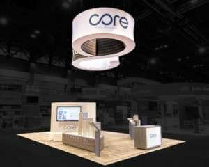
At a business event, there are usually varied design display for different brands with a different value proposition. As in this image, it comes out clear that the brand is focusing on uncluttered customer experience.
The breathing space looks clear with no side walls and a clear low-end table design. These calculated designs are usually crafted to empower brand in stealing the spotlight.
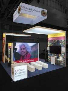 CREATING SPACE FOR BRAND DEMONSTRATION
The easiest way of getting your message right is by clear brand demonstration in the presence of the potential customers.
This above shown design has smartly drawn customers attraction through its big screens and LED’s with the addition of a sitting area, giving a feeling of complete tutorial setup.
Brands can incorporate this design to showcase their identity or the range of products in the form of live demonstrations.
INCORPORATE SPACE TO BUILD RELATIONS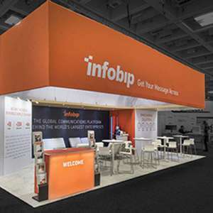
What is the idea of your brand? Customer engagement or customer serving? You need to be clear about your brand focus and philosophies and the message that you want to convey to your visitors.
If you are a company/brand involved in the business of customer care and satisfaction, this design is just the right choice for you.
Setup a design where the brand is broadly highlighting with the floor section completely occupied with sitting arrangement to accommodate maximum customers.
 SYNCHRONIZATION FOR A RICH CUSTOMER EXPERIENCE
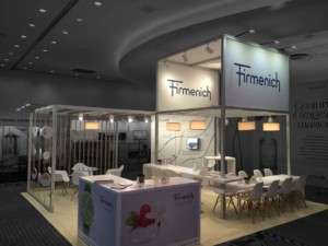
The look and the feel of the above shown design can cut down your competition in a go. It’s a human tendency to get attracted to what is delightful.
Create designs for your brand in a manner where the complete ambiance is in sync with your brand. This design has a beautiful looking appearance which can give a feeling of rich experience to the visitors.
Complement your brand identity and increase your chances of future business by creating a finely crafted and synchronized designs.
SPOTLIGHT THE LOOK AND FEEL OF YOUR BRAND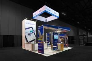
The brand in the picture below/above has strategically placed a brilliant lighting to create a contrast in its overall design.
The outline looks pretty defined along with the synchronization in color. The best part about the design is the spotlight that is smartly highlighted on the brand name right in the middle.
The special design can make your brand come upfront and be easily discoverable.
 EASY INSTALLATION AND DEPLOYMENT
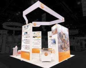
Get your purpose sorted at minimal effort and less spending by getting your desired design customized as in the picture shown above.
Giving a close look into this chosen design by the brand, the complete idea of participating in a business event is answered at a minimum cost.
Also, installing and dismantling of this design is quite easy as it doesn’t have much proportion to add to it. You can go for this design if you are a regular exhibitor and need to save time and money on the go.
SHOWCASE YOUR BRAND VALUE PROPORTION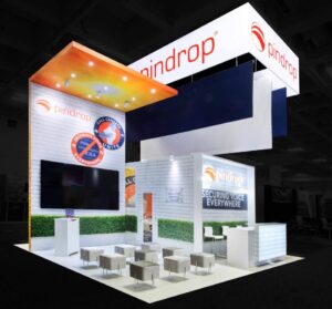
No matter what the business is, in the end, it’s all about your brand’s value proposition. Why not reflect the same in your both design itself?
The idea behind this booth design at a business event is aligning the brands’ value proportion with a clear reflection on the stated designs.
As you can see in the background, the content is strategically placed to give volume to the design and a language to the brand. You can deploy this design to speak more in fewer words!
 GREEN MARKETING FOR YOUR BRAND
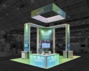
The design of your chosen trade show booth, when displayed at a trade show speaks volumes about your brand. In fact, it should be designed to easily depict the nature of the business.
This lavishing, green color design in the picture above is crafted to showcase the integrity of the business and is reflecting the social responsibility of the company towards the environment.
BUILD BRAND CONSISTENCY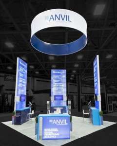
By placing your brand logo easily discoverable from each corner of the trade show hall draws a clear focus on the logo every time the visitor crosses your brand at a trade show.
The placement of various signage board with the brand logo on the top is dominating the complete setup.
 INVEST INTO VISUAL MERCHANDISING
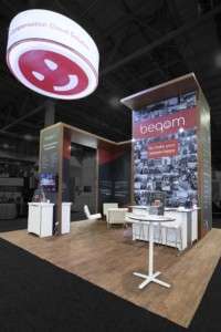
If the whole idea behind your participation in a trade show is to visually merchandise your product and services, this design can clearly suit your purpose.
The strategically placed sprint points at the three different corners in the picture shown above serve three different purposes that is designed in a circular way to maintain the flow of the visitors.
SHOWCASE YOUR BRAND AND KEEP IT UPFRONT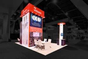
The brand aims to showcase the brand image as a center of attraction through the above shown design.
You can opt for this creative designs to strategically position your brand into the minds of the potential clients without letting the different components block its way.
The basic use of this design is the positioning of your brand image into the sight of the potential visitors.
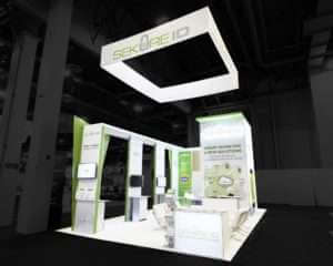 BALANCE YOUR DESIGN TO EXPAND OUTREACH
LEDs, immersive technology, smart positioning of the brand etc. work in favor of expanding your brand reach.
As in this design shown above, the complete balance of color combination along with the key branding is solving the purpose of outreaching your brand identity.
The three LED’s are positioned in accordance to enable each visitor to get the essence of the brand.
