Conceptual Design for CCW 2021 - Las Vegas

HIGH IMPACT GRAPHICS

CREATING HIGH IMPACT WITH BACKLIT WALLS

THE RESULT

Bright – CCW 2021 – Las Vegas, NV – Industry: Technology

Exhibitor Background

Bright Software, Inc. is an immersive learning technology firm that provides employees with real-world experience through practice-based simulations. Bright has a fair share of training programs, too often with uninspiring outcomes, as they led global learning and development initiatives affecting millions of learners in hundreds of countries and a dozen languages.

Create a scalable and repeatable strategy for evaluating interactions, enabling your team to execute their best job in half the time, and improving satisfaction metrics that drive revenue and retention.

Case Study for Bright

The Challenge

As one of the most acclaimed exhibition stand builders and designers, we have a number of clients contact our team, and we have consistently created crowd-pulling exhibits. As the adventure progresses, we get to work with several clients who put us to the test with their criteria and time constraints. One such partnership was with Bright, a brand that has earned a name for itself in the education industry, particularly in the areas of online learning.

Challenges and Requirements

Bright intended to attend CCW 2021 in Las Vegas, which is one of the greatest exhibits for the education industry, but they realized it would be a difficult effort. The firm approached us only a few months before the exhibition, and our team had little time for tests and experimentation. They needed a one-of-a-kind design with a high-end appearance. The stakes were really high. Overall, it was a difficult assignment, and time was flying by.

The Solution

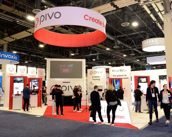
We rolled up our sleeves and pushed a number of buttons to expedite the procedure. Our team was able to put on an exhibit that accurately matched the brand’s philosophy, as Bright defined. Even fellow exhibitors were astounded by how the show made such a big impression in such a little area. The conference place finished out beautifully and was ideal for product tasting and exhibition. The banner was strategically positioned in the center of the conference room to act as a wall, effectively using the available space. The multi-media displays and huge graphical displays made a larger-than-life appearance, attracting attention.

The Results

The display design proved to be quite beneficial since it was able to handle several people at the same time. The conclusion demonstrated, once again, that if you have the necessary abilities and expertise, time is never an obstacle to accomplishing excellent outcomes.

MORE CASE STUDIES